Shiatsuwithmaik Brand Design
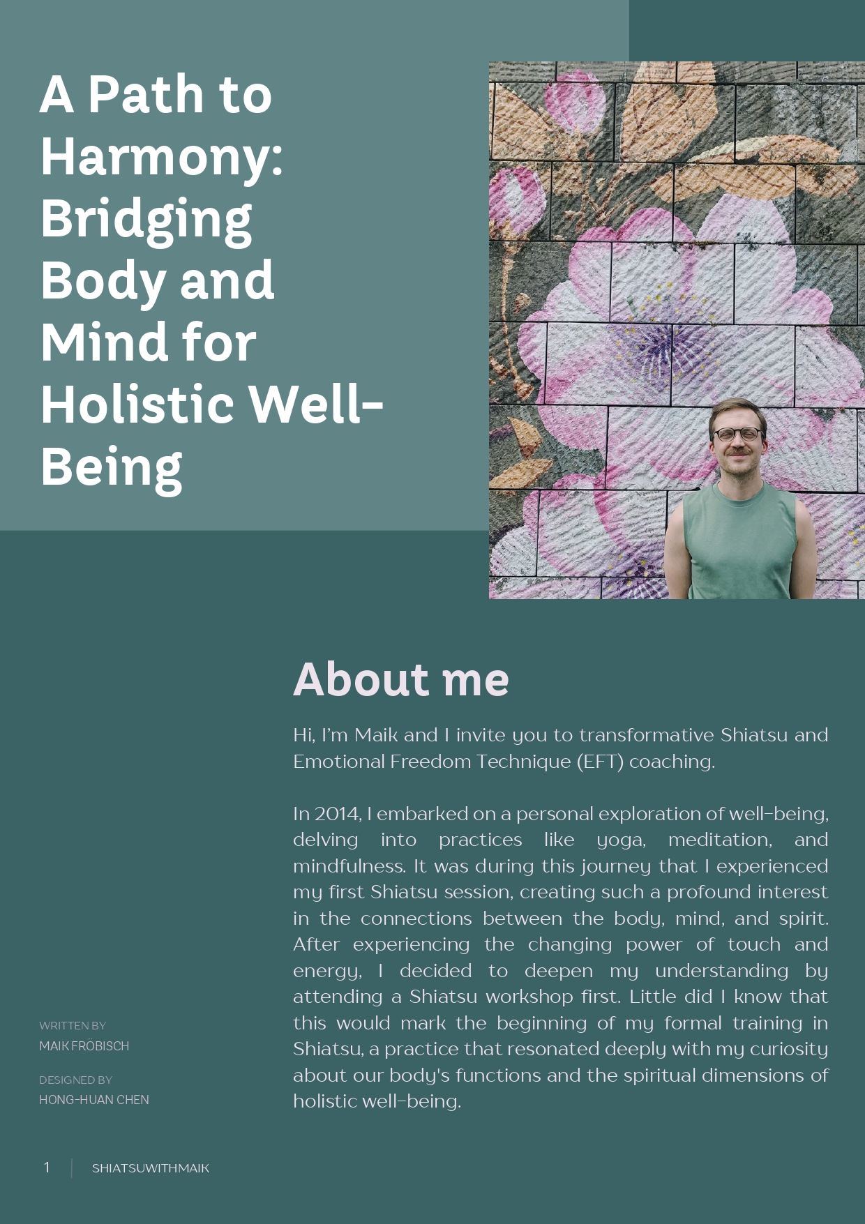
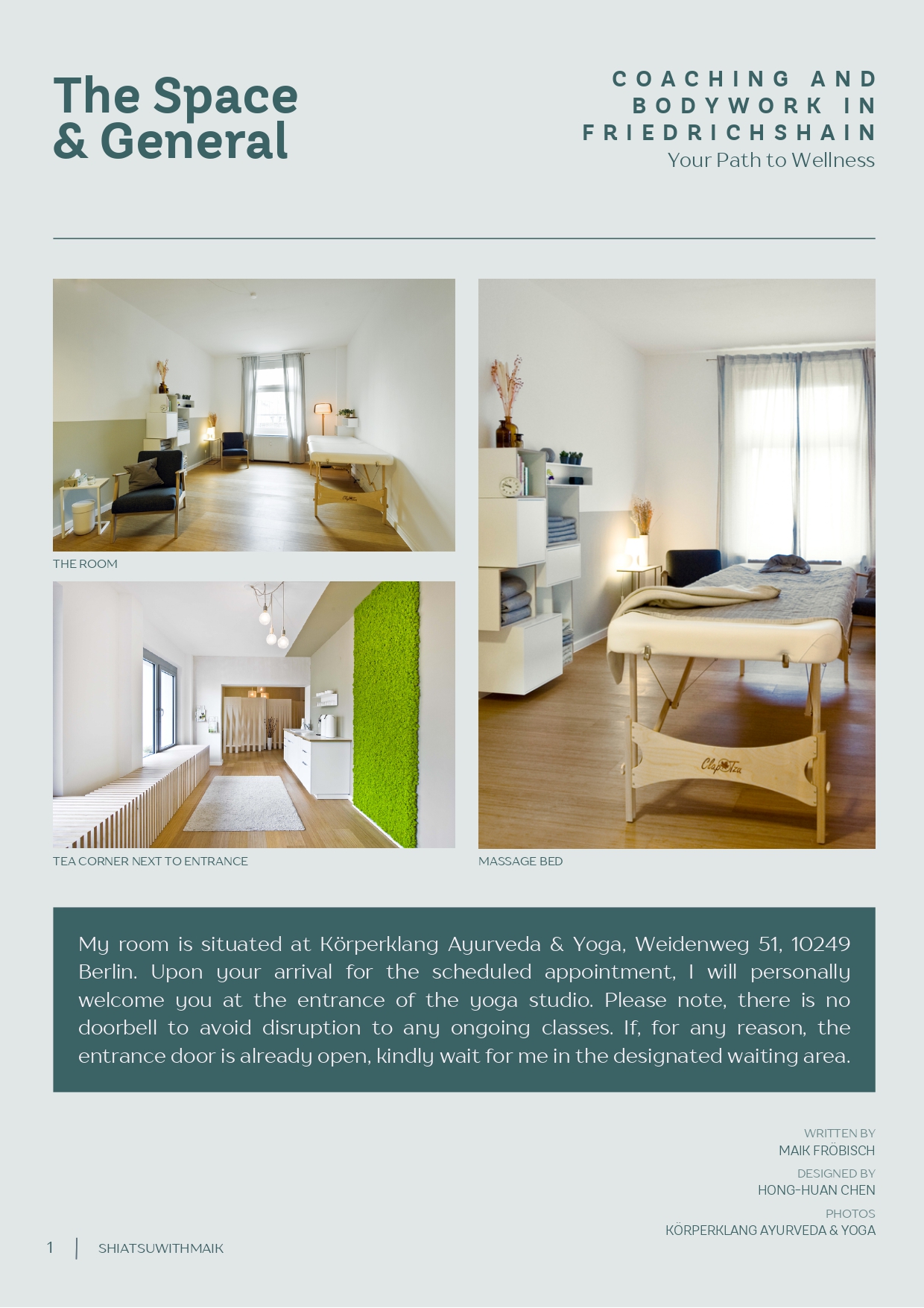
Shiatsuwithmaik, a new well-being brand in Berlin, offers a range of services including Shiatsu, EFT-coaching, and wellness massage. The client aimed to create a brand identity that would convey tranquility, connection to nature, and a sense of calm. My role was to develop a brand design that embodied these qualities and appealed to their target audience.
Design Concept
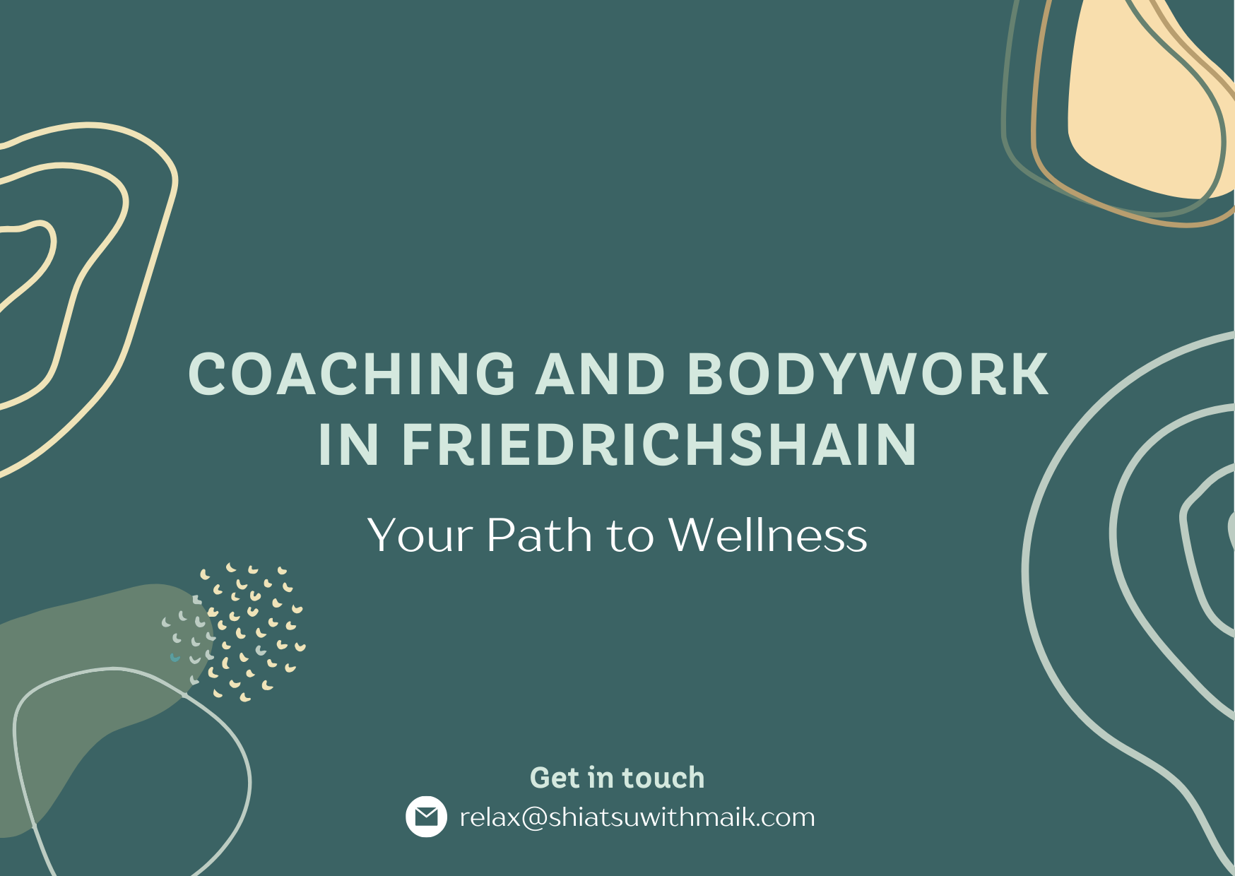
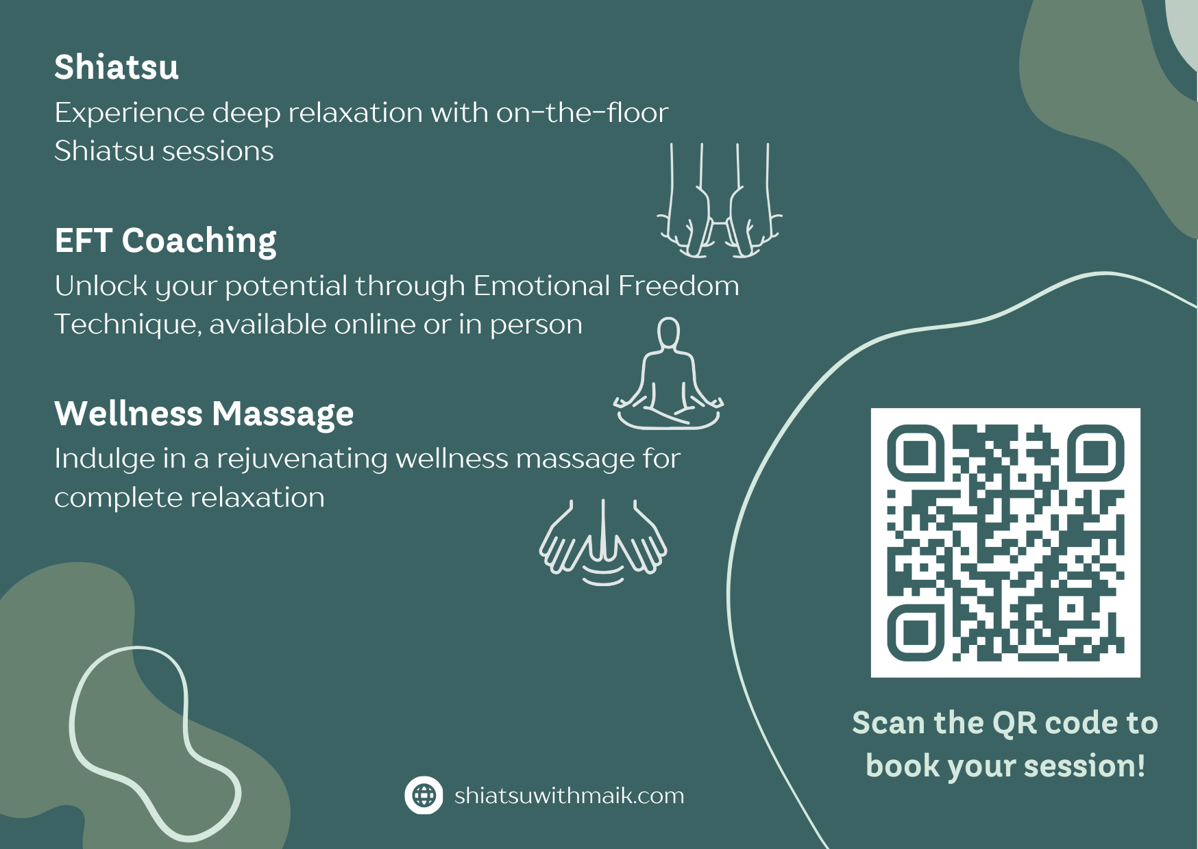
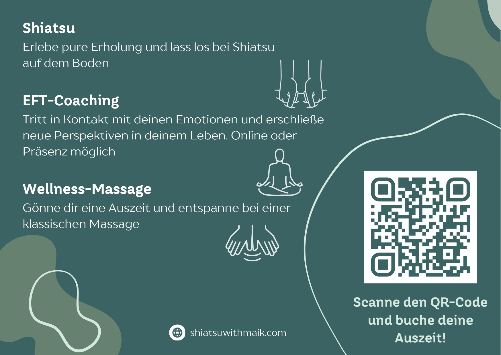
The design concept focused on utilizing a green color palette with simple lines and color blocks. The objective was to evoke a sense of nature and serenity, aligning with the holistic approach of Shiatsuwithmaik’s services.

Execution
- Color Palette: The primary colors chosen were green and yellow pastels, symbolizing nature, growth, and positivity. These colors were carefully selected to create a calming and welcoming atmosphere.
- Font Choice: TT Hazelnuts and TT Drugs were used for their rounded, approachable style. These fonts conveyed a sense of softness and friendliness, essential for a wellness brand.
- Visual Elements: The design featured clean lines and minimalist color blocks, ensuring a modern and uncluttered look. This simplicity was key in communicating the brand’s focus on clarity and well-being.
- Additional Elements: To further enhance the natural connection, subtle imagery of leaves and natural textures were incorporated into the background, reinforcing the theme of nature and relaxation.
Outcome
The resulting design was a harmonious blend of calmness and professionalism. It effectively communicated the essence of Shiatsuwithmaik, making potential clients feel at ease and connected to the natural world. The brand’s visual identity helps Shiatsuwithmaik establish a smooth entrance into the wellness industry in Berlin.
